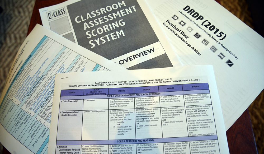
QRIS is undeniably complex – and with reason! Quality rating and improvement systems assess, improve and communicate the quality of early childhood programs, and can be thought of as a framework for improving quality in the early learning system overall.
However, this complexity makes it a very hard concept to explain to parents and providers, two of the primary target audiences of QRIS. When parents and providers don’t understand, they often feel confused and choose not to learn more. So how can systems engage their target audience of parents and providers to understand what QRIS can do for them and how to access it?
Here are three simple communications goals to ensure your audience can understand and connect with your QRIS.
Simple, jargon-free language
Let’s be honest. The name ‘QRIS’ is complicated in and of itself. Even spelled out, ‘quality rating and improvement system’ doesn’t offer many clues as to what the system means for parents and providers. That’s why it’s so important that QRIS be explained in simple, jargon-free language throughout all communications. Swap phrases like “systems-building” and “continuous quality improvement” for simple explanations of what QRIS offers to parents and providers. I particularly like Minnesota’s Parent Aware because it explains the problem and positions Parent Aware as the solution. Read for yourself: “Too many of Minnesota’s children are not prepared for kindergarten. Parent Aware gives you the tools and information to find the best quality child care and early education for your child.”
Logos that connect with your target audience
The goal of any logo is to allow customers to identify with a brand. For quality rating and improvement systems, a strong logo should quickly convey the purpose and relevance of QRIS to both parents and providers, and therefore should indicate three key elements: early childhood education, quality improvement and location. These three aspects combined are most likely to connect with parents and providers, yet you’d be surprised how many logos are do not include them. Location is especially important in states with regional systems, such as Florida and California. Additionally, many systems have similar, or even the same, names – Quality Start is the QRIS in Louisiana and several Southern California counties – so location can help a parent or provider be sure they’re looking at the right information.
Easy to navigate and use
When it comes to your website and communication materials, it shouldn’t be hard for a parent or provider to accomplish their ‘end goal’. For parents, that’s generally using your site to find quality childcare, and for providers, it’s often signing up to participate. And yet, many websites and promotional materials don’t have clear calls to action, making it hard for your target audience to understand how to engage. On websites, you can make it easy by splitting up information for parents and providers and including “search” or “sign up” options on each relevant page. Promotional materials should always be designed to not only be informational, but also provide next steps for parents and providers.
